Your website has exactly 3 seconds to make a first impression. After that, most visitors leave — and they rarely come back.
This is not a design problem. It is a web design principles problem. A site can look stunning and still fail completely at guiding users toward action, communicating trust, or working across devices. The difference between a website that converts and one that confuses always comes down to how well it applies the fundamentals of UX design principles for websites.
This complete guide covers every core principle — from visual hierarchy in web design to accessibility standards, mobile-first thinking, and website usability principles that directly impact business results. Whether you are a beginner designer, a developer crossing into design territory, a startup founder building your first product, or a business owner evaluating a redesign — this guide gives you the framework you need.
Web design principles are the foundational rules that determine how a website looks, feels, and functions for its users. They are not aesthetic preferences. They are tested, evidence-backed guidelines that define whether a digital experience is intuitive or frustrating, trustworthy or suspicious, conversion-ready or leaking customers.
Poor application of these principles costs businesses real money. A confusing navigation structure causes users to leave. A slow-loading page kills conversions. Inaccessible design locks out a significant portion of your audience. Text that is hard to read loses the reader before they reach your call to action.
Getting UX design best practices right is not optional for businesses competing in 2025. It is the foundation of every other digital marketing effort you run. Traffic means nothing if the experience drives visitors away.
If your current website is already showing signs of poor UX — high bounce rates, low time on page, or declining enquiries — read our breakdown of why your business website is losing customers every day to identify the specific issues before going further.
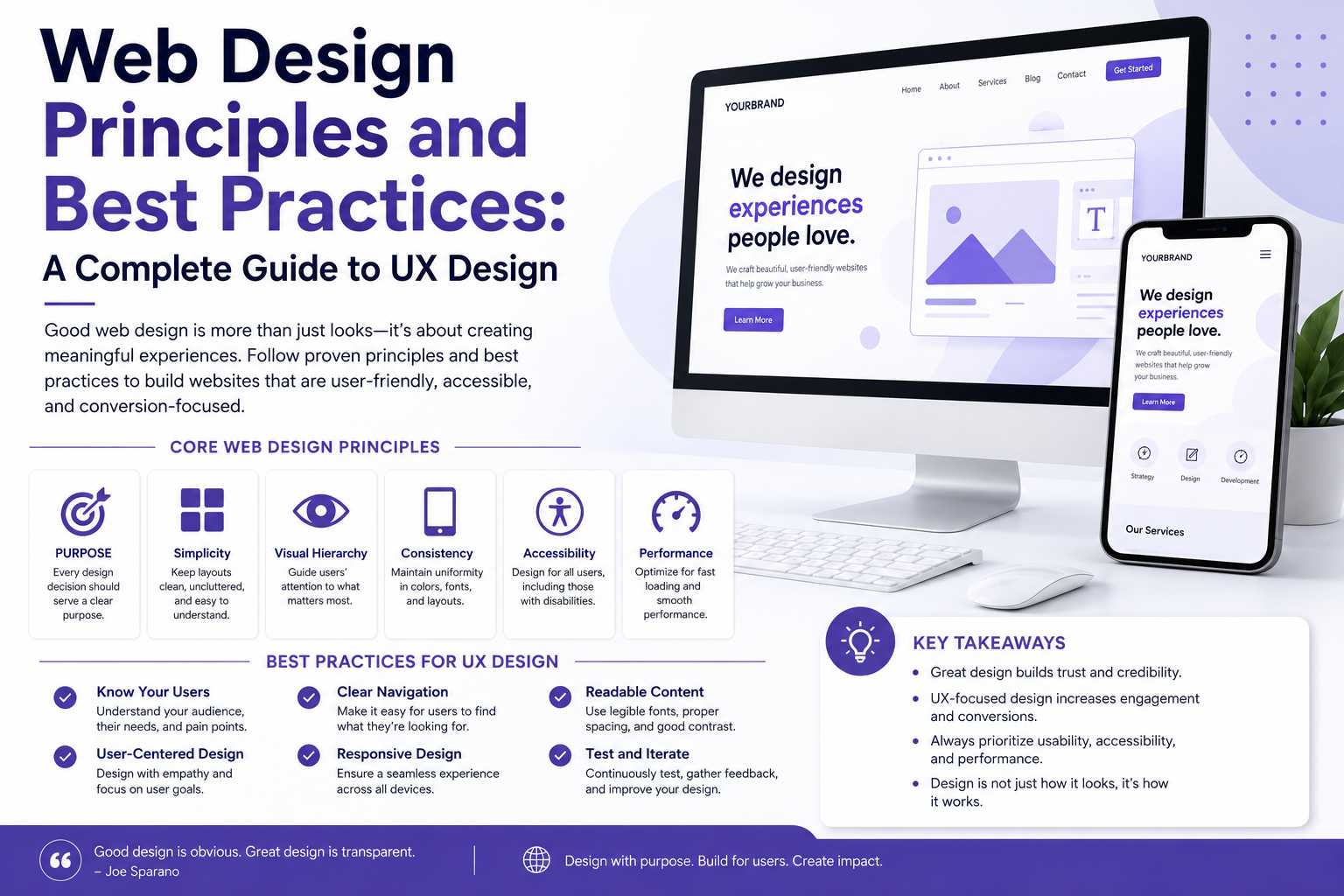
Visual hierarchy is the arrangement of design elements in a way that guides the user’s eye through content in a deliberate order — from the most important information to the least.
Without visual hierarchy, every element on a page competes equally for attention. The result is visual noise. The user does not know where to look first, what to do, or where to go next.
Hierarchy is created through:
Size: Larger elements attract attention first. Your H1 headline should be the largest text on the page because it carries the primary message.
Colour and contrast: High-contrast elements — a bold CTA button against a neutral background, for instance — naturally draw the eye before low-contrast ones.
Spacing and whitespace: Elements surrounded by whitespace feel more important. Whitespace is not empty space — it is a visual tool that creates breathing room and communicates priority.
Typography weight: Bold text within a paragraph signals importance. Use it sparingly so it retains its effect.
Position: Users in left-to-right reading cultures scan in an F-pattern or Z-pattern. Placing your most important message in the top-left or across the top of the page aligns with natural eye movement.
A practical example: a homepage hero section should present the headline first (what you do and for whom), the subheading second (why it matters), and the CTA button third (what to do next). This sequence respects visual hierarchy and dramatically improves conversion rates.
Website usability is about how easily users can accomplish their goals on your site. Jakob Nielsen’s ten usability heuristics remain the gold standard reference, but in practical terms, usability comes down to five core questions:
Can users immediately understand what your website is about?
Can they find what they are looking for without effort?
Can they complete key tasks — purchase, enquire, register — without confusion?
If something goes wrong, does the site help them recover?
Is the experience consistent across pages and devices?
A website that fails any one of these is a website with a usability problem — regardless of how it looks.
Cognitive load is one of the most underestimated usability issues. Every choice a user is forced to make consumes mental energy. The more options, the more distractions, the more steps to complete a task — the higher the cognitive load and the lower the conversion rate. The principle of reducing cognitive load underlies almost every specific usability guideline: fewer menu items, shorter forms, clearer CTAs, simpler page layouts.
Navigation is the skeleton of your website’s user experience. Poor navigation is consistently the top reason users abandon websites before converting.
Effective website navigation design principles include:
Keep the primary navigation to 5 to 7 items. Beyond this, users experience choice paralysis and cannot retain the structure in working memory.
Use clear, descriptive labels. “Services” is better than “What We Do.” “Contact Us” is better than “Let’s Talk.” Clever labels might feel on-brand but they reduce findability.
Make the current page obvious. Users need to know where they are in relation to the whole site at all times. Active states on navigation items, breadcrumbs, and page titles all serve this function.
Keep navigation consistent across all pages. Changing the position, style, or labels of navigation between pages disorients users and forces them to re-learn the interface.
Include a search function for content-heavy sites. When a site has more than 20 pages of content, search becomes a usability necessity, not a luxury.
Make your logo a home link. This is so universally expected that violating it confuses users who click the logo expecting to return to the homepage.
On mobile, prioritize the most important navigation items in a hamburger menu, but consider persistent bottom navigation bars for apps and very mobile-heavy websites — thumb reach on large phones makes bottom navigation significantly more usable.
In 2025, responsive web design is not a feature — it is a baseline requirement. Over 60 percent of global web traffic now comes from mobile devices. In India, that figure is even higher. A website that does not work well on a smartphone is not a functional website.
Responsive web design best practices include:
Fluid grids: Use percentage-based widths rather than fixed pixel widths so layouts adapt naturally to any screen size.
Flexible images: Images should scale within their containing elements. Use max-width: 100% as a baseline rule to prevent images from overflowing containers on smaller screens.
Media queries: Use CSS media queries to apply different layout rules at specific breakpoints — typically mobile (under 768px), tablet (768px to 1024px), and desktop (above 1024px).
Touch targets: On touchscreens, buttons and links need to be large enough to tap accurately without hitting adjacent elements. The minimum recommended touch target size is 44px by 44px.
Readable font sizes: A minimum of 16px body text for mobile screens. Anything smaller requires users to pinch and zoom, which is a serious usability failure.
No horizontal scrolling: A mobile user should never have to scroll horizontally. If they do, elements are overflowing the viewport — a direct result of non-responsive design.
Mobile-first web design means designing for the smallest screen first, then progressively enhancing the experience for larger screens. It is the opposite of the traditional approach of designing for desktop and then shrinking down for mobile.
Why does it matter? Because designing for constraints forces better decisions. When you have limited screen space, you must prioritize ruthlessly. Only the most important content and actions make it onto a mobile design. This clarity of purpose then carries through to the desktop version — which ends up cleaner and more focused as a result.
Mobile-first also aligns with how Google evaluates websites. Google’s mobile-first indexing means your mobile experience is the version that determines your search rankings, regardless of how your desktop site performs.
Practically, mobile-first design means:
Starting wireframes and prototypes at 375px width (iPhone size)
Designing navigation for thumb reach before adapting for mouse
Writing content that works in short, scannable blocks before expanding for larger screens
Testing on real devices, not just browser resize tools
UI and UX are frequently used interchangeably but they describe different layers of the design process.
UX (User Experience) is the overall experience a person has when interacting with your website or product. It covers the entire journey — how easy it is to complete a task, how the site makes the user feel, whether they can achieve their goals efficiently.
UI (User Interface) is the visual and interactive layer — the buttons, typography, colours, icons, spacing, and layout that the user actually sees and touches.
Good UX can be undermined by poor UI — a logically structured website that looks untrustworthy or unattractive will still lose users. Good UI can be undermined by poor UX — a beautiful website with confusing navigation or broken user flows will fail regardless of how it looks.
The UI UX design fundamentals that matter most for web design are:
Consistency — use the same visual language (colours, fonts, button styles, spacing) across every page
Feedback — every interactive element should respond to user actions (hover states, loading indicators, success messages)
Error prevention — design interfaces that make errors less likely (clear form labels, input validation, confirmation dialogs for destructive actions)
Flexibility — experienced users should have shortcuts; new users should have clear guidance
Accessibility in web design means designing websites that can be used by people of all abilities — including those with visual, auditory, motor, or cognitive impairments.
Beyond being the right thing to do, accessibility is a legal requirement in many jurisdictions and a ranking factor that Google’s algorithms increasingly reward. It also simply makes websites better for everyone.
The Web Content Accessibility Guidelines (WCAG 2.1) are the global standard for web accessibility. They organize requirements around four principles — Perceivable, Operable, Understandable, and Robust (POUR).
Key accessibility standards in web design include:
Colour contrast: Text must have a contrast ratio of at least 4.5:1 against its background for body text, and 3:1 for large text. Low contrast makes text unreadable for users with visual impairments — and for anyone reading on a bright screen outdoors.
Alt text for images: Every meaningful image should have descriptive alt text so screen readers can communicate its content to visually impaired users. Decorative images should have empty alt attributes (alt=””) so screen readers skip them.
Keyboard navigability: Every function on your website should be accessible using only a keyboard — no mouse required. This matters for users with motor impairments and is tested by tabbing through interactive elements.
Semantic HTML: Using correct HTML elements for their intended purpose — headings as headings, buttons as buttons, lists as lists — gives assistive technologies the structural context they need to interpret content correctly.
Captions and transcripts: Video content should include captions for deaf and hard-of-hearing users. Audio content should include transcripts.
Form labels: Every form input must have an associated label that remains visible — not just placeholder text that disappears when the user starts typing.
Accessibility is not an afterthought. Building it into the design process from the start is dramatically more efficient than retrofitting it after launch.
Beautiful design that does not convert is expensive decoration. Web design principles for conversion ensure that your design choices actively move users toward the actions that matter to your business — enquiries, purchases, sign-ups, downloads.
Your homepage should immediately answer three questions: What is this? Who is it for? What should I do next? Ambiguity kills conversion. Users will not invest effort in decoding a clever headline when a clear one is available elsewhere.
Every page should have one primary call to action. If you offer multiple equally prominent CTAs, users are forced to make a decision — and many will make none. Secondary CTAs are fine, but they should be visually subordinate to the primary one.
Users convert on websites they trust. Trust is communicated through design — professional photography, consistent branding, real testimonials with names and photos, recognizable client logos, security badges on forms, and a clear contact address all function as trust signals.
A one-second delay in page load time can reduce conversions by up to 7 percent. Website speed optimization is a design decision, not just a technical one. Heavy images, bloated scripts, unoptimized fonts, and render-blocking resources are all design and development choices that directly damage conversion rates.
The content visible without scrolling — above the fold — carries disproportionate weight. Your headline, subheading, primary visual, and CTA should all be present above the fold on desktop. On mobile, at minimum the headline and a visible CTA should appear before scrolling.
For a deeper technical understanding of how page performance affects user experience and search ranking, our complete guide to Core Web Vitals optimization for LCP, CLS and INP in 2026 covers every metric you need to monitor and improve.
The best UX research and design process follows a structured cycle — not a one-time sprint.
Understand your users before you design for them. User research includes user interviews, surveys, competitor analysis, analytics review, and heatmap analysis of existing pages. You are looking for: who your users are, what goals they have, what frustrations they experience, and what language they use to describe their problems.
Before any visual design, organize your content. Information architecture (IA) defines the structure and hierarchy of pages, the navigation system, and the content groupings that will shape the entire site structure. Card sorting — where users group content into categories that make sense to them — is a practical IA research method.
Wireframes are low-fidelity layouts that establish structure without visual design. They define where content, navigation, CTAs, images, and functional elements sit on each page. Wireframing in grayscale forces focus on structure and flow rather than aesthetics.
Interactive prototypes simulate the experience of using the website before any code is written. Tools like Figma allow designers to create clickable prototypes that can be tested with real users. Catching usability problems at this stage is dramatically cheaper than fixing them after development.
Test your prototype with real users — ideally 5 to 8 people from your target audience. Watch where they hesitate, where they click first, where they get confused, and what language they use when describing what they see. This qualitative data is more valuable than any design heuristic.
Hand off a fully documented design system — including components, spacing rules, colour tokens, typography scales, and interaction states — to developers. A well-documented design reduces development time and inconsistency.
Design does not end at launch. Monitor analytics, conversion rates, bounce rates, heatmaps, and session recordings after launch. Use data to identify pages that are underperforming and run A/B tests to improve them iteratively.
Here is a how to design a user-friendly website checklist you can apply to any project or audit:
Navigation and Structure
Primary navigation has 5 to 7 items with clear, descriptive labels
Current page is always visible in navigation
Breadcrumbs present on content-heavy or deep-hierarchy sites
Footer navigation includes all key pages
Search available on sites with substantial content
Visual Design
Clear visual hierarchy on every page — primary message, secondary content, CTA
Consistent use of brand colours, fonts, and spacing throughout
Sufficient colour contrast on all text elements
Whitespace used intentionally to create focus and reduce clutter
Content
Headlines are clear and benefit-focused
Body copy is scannable — short paragraphs, bullet points where appropriate
CTA copy is specific (Get a Free Quote, Start My Trial) not generic (Submit, Click Here)
Images support the content and have alt text
Performance and Technical
Page load time under 3 seconds on mobile
Images compressed and next-gen formats used (WebP)
Core Web Vitals passing in Google Search Console
HTTPS secure throughout
Accessibility
All images have alt text
Forms have visible labels
Site is navigable by keyboard alone
WCAG 2.1 AA contrast ratios met
Mobile Experience
Fully responsive at all screen sizes
Touch targets minimum 44px
No horizontal scrolling on mobile
Font sizes readable without zooming
If you are new to web design, these are the mistakes that most consistently damage user experience:
Using too many fonts. Stick to two typefaces — one for headings, one for body. More than two creates visual inconsistency and feels unprofessional.
Ignoring whitespace. New designers often try to fill every space. Whitespace is not wasted space — it is the breathing room that makes content legible and interfaces feel premium.
Designing only for desktop. Always design and test on mobile first. A layout that looks perfect on a 27-inch monitor can be completely broken on a phone.
Making CTAs the same colour as everything else. Your primary CTA should stand out visually from the rest of the page. If everything is the same colour, nothing is a CTA.
Using stock photography that feels generic. Generic stock photos — handshakes, people pointing at laptops, fake smiling teams — erode trust. Real photography of real people and real environments performs significantly better.
Not testing with real users. No designer, however experienced, can predict with certainty how a real user will interact with their design. Testing is not optional — it is how you find out what you missed.
For businesses in Kochi and Kerala evaluating whether their current web presence meets these standards, understanding what to look for in a design partner is critical before investing in a redesign. Our guide on how to choose the right website design company in Kerala helps you ask the right questions before signing any agreement.
Engagement — time on page, pages per session, scroll depth, interaction rate — is a signal of how well your design is serving user intent. Low engagement usually points to one of three problems: the wrong audience arrived (traffic quality issue), the content did not match what they expected (relevance issue), or the experience was poor enough to cause them to leave (UX issue).
Design principles that directly improve engagement include:
Progressive disclosure: Show users only what they need at each stage. Reveal additional depth as they demonstrate interest — through tabs, accordions, and expanding sections — rather than presenting everything at once.
Storytelling structure: The most engaging websites guide users through a narrative — problem, solution, proof, action. This mirrors the natural way humans process and make decisions, and it keeps users reading further into the page.
Interactive elements: Calculators, quizzes, configurators, and interactive comparisons increase engagement because they give users a reason to act rather than passively consume.
Internal linking: Guiding users from one page to a logically related next page keeps them on your site longer and deepens their engagement with your content. Every page should have at least one contextually relevant link pointing to another page on the same site.
Consistent design language across pages: When every page looks and feels consistent — same header, same fonts, same colour system, same component styles — users develop familiarity with your site quickly, which reduces friction and increases time on site.
Design trends evolve, but the underlying principles do not. The best trends of 2025 are those that serve user experience rather than complicate it.
AI-powered personalization is changing how websites adapt content and layout to individual user behaviour — but only works when built on a solid UX foundation.
Minimalist design with bold typography is increasing — reducing cognitive load while making brand messaging more impactful.
Dark mode options respond to user preference and reduce eye strain in low-light environments.
Micro-interactions — small animations triggered by user actions — provide feedback and make interfaces feel responsive and alive without adding complexity.
For a deeper look at where visual and interaction design is heading, our guide on web design trends 2026 including organic layouts and AI experiences explores what is emerging and what will last.
1. What are the most important web design principles for a business website?
The most critical principles for a business website are visual hierarchy (guiding users to your most important content and CTA first), usability (making every task easy to complete), mobile responsiveness (functioning perfectly on all devices), page speed (loading in under 3 seconds), and trust-building design (professional appearance, real testimonials, clear contact information). All five directly impact both user experience and conversion rates.
2. What is the difference between UI design and UX design?
UX (User Experience) design is concerned with the overall experience — how easy and satisfying it is to accomplish a goal on your website. UI (User Interface) design is concerned with the visual layer — how the interface looks and how interactive elements behave. Good web design requires both: strong UX structure and architecture, expressed through strong UI visual execution.
3. How do I know if my website has poor UX?
Key indicators of poor UX include: high bounce rate (above 70% for most business websites), low average session duration, users failing to reach key pages (visible in analytics), low conversion rate relative to traffic volume, and direct user feedback about confusion or difficulty. Google Search Console, Google Analytics, and heatmap tools like Hotjar can identify specific pages and elements causing the most friction.
4. What does mobile-first web design mean in practice?
Mobile-first means starting your design process at the smallest screen size — typically 375px wide — and building upward for larger screens. It means prioritizing the content and features most important to mobile users, designing touch-friendly navigation and interactive elements, and testing on real devices throughout the process. It does not mean neglecting desktop — it means ensuring mobile is as good or better than desktop, not an afterthought.
5. How does web design affect SEO and search rankings?
Web design affects SEO in multiple direct ways. Page speed is a confirmed ranking factor. Core Web Vitals (LCP, CLS, INP) are measured and weighted by Google. Mobile-friendliness is evaluated through Google’s mobile-first indexing. Site structure and internal linking affect how Google crawls and indexes pages. Accessibility improvements that use semantic HTML also improve how search engines understand your content. Design and SEO are not separate disciplines — they are deeply interconnected.
The most visually impressive websites in the world fail every day because they ignored the fundamentals. The web design principles and best practices covered in this guide are not theoretical — they are the specific decisions that determine whether your website builds trust, guides users to action, and delivers measurable results for your business.
Visual hierarchy, usability, navigation clarity, mobile-first thinking, accessibility, and conversion-focused design are not optional additions to a brief. They are the brief. Everything else — colour palettes, photography styles, animation choices — sits on top of this foundation.
If your current website is not performing to the standard your business deserves, the answer is almost always found in how well these principles are applied — not in whether you need a new logo or a different shade of blue.
Ready to build a website that actually works?
Teknoppy is a web design and development company in Kochi helping businesses across Kerala and beyond build user-focused, conversion-ready websites grounded in the principles covered in this guide. From UX strategy and wireframing through to development and post-launch optimization, we handle every stage in-house.
Get a free website consultation with Teknoppy — tell us about your project and we will come back to you within 24 hours.
Or explore our web design and development services in Kochi to see how we approach every project from the user’s perspective first.

Communicate with our experts to bring out better solutions to your problem.
 +91 6282249224
This will close in 0 seconds


