
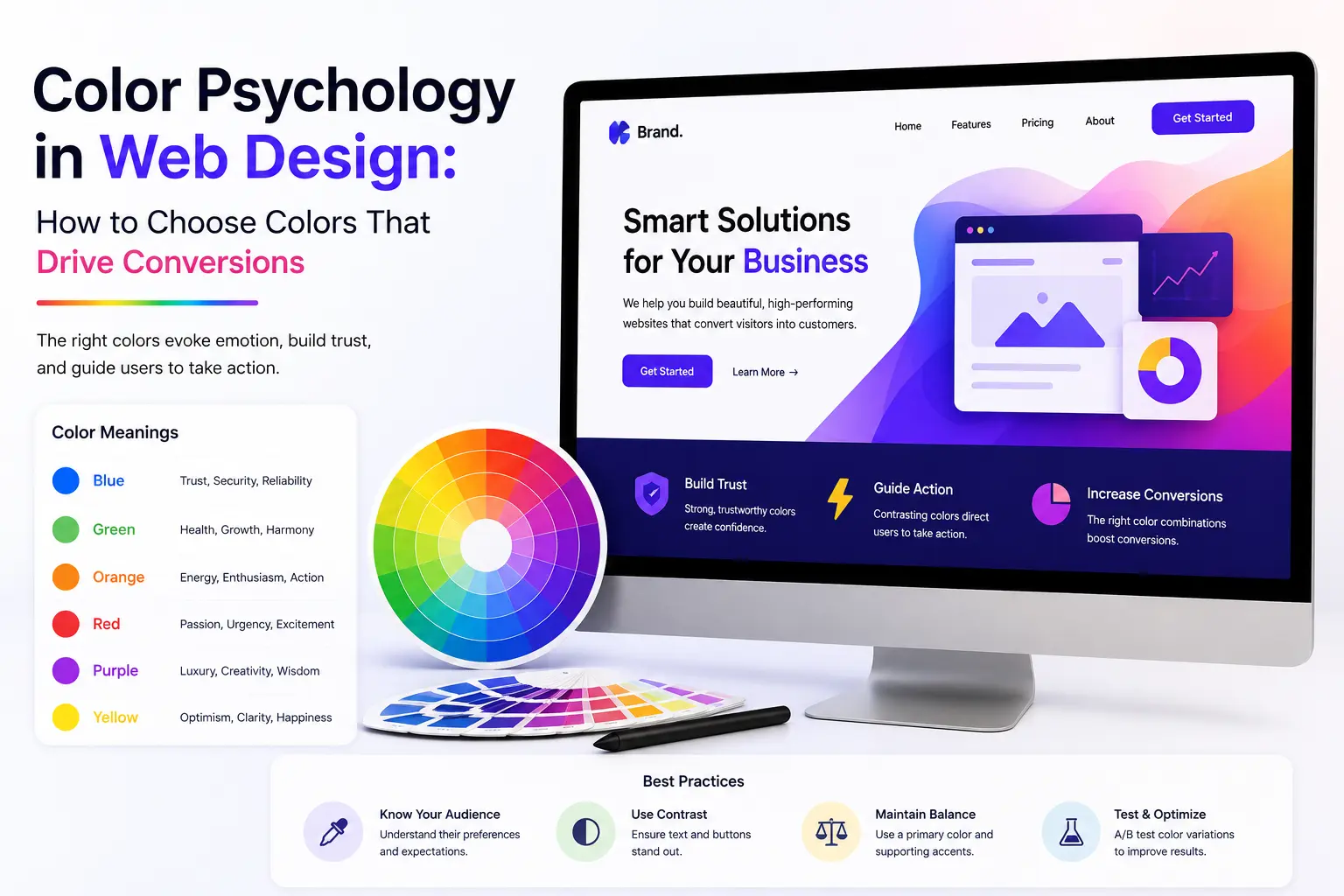
Color is one of the fastest signals a visitor processes when they land on your site, often shaping trust and intent before they read a single word. Understanding color psychology in web design helps you move beyond personal taste and choose a palette that actually supports your business goals. This guide covers the psychology behind common colors, how to build a scheme around them, and how to apply that knowledge to boost conversions.
Visitors form an opinion about a website within seconds, and color is one of the biggest drivers of that first impression. The right palette builds trust, guides attention toward key actions, and reinforces brand identity, while the wrong one can create friction without the visitor ever knowing why they hesitated. Getting color psychology in web design right is less about following trends and more about matching color choices to how you want users to feel and act.
Color theory for websites starts with understanding the color wheel and how hues relate to one another. Complementary colors, which sit opposite each other on the wheel, create strong contrast that’s useful for calls to action. Analogous colors, which sit next to each other, create a calmer, more cohesive feel suited to backgrounds and supporting elements. Knowing these relationships helps you build a scheme with clear visual hierarchy instead of a palette that feels random.
Different colors carry different psychological associations, and understanding these helps guide how to choose website colors for your specific audience and industry.
Red signals urgency and energy, making it effective for limited-time offers and CTA buttons, though overuse can feel aggressive. Orange conveys friendliness and confidence and works well for buttons that need to feel approachable rather than alarming. Yellow suggests optimism and creativity but performs best as an accent rather than a dominant color, since large amounts can feel overwhelming.
Blue is the most trusted color in digital design, which is why it dominates finance, healthcare, and technology websites. Green connects to growth, health, and reassurance, making it a strong choice for sustainability, wellness, and finance-related “go” actions. Purple signals luxury and creativity and suits premium or design-forward brands.
Black conveys sophistication and authority, white communicates simplicity and space, and grey provides a balanced, professional backdrop that lets brand colors stand out without competing for attention.
While there is no single universally best color, patterns emerge across industries. High-contrast colors like orange and red tend to perform well for CTA button psychology because they stand out against neutral or cool backgrounds. Blue consistently supports form completions and sign-ups because of the trust it signals. The best colors for website conversions are ultimately the ones that contrast clearly against your background and align with the emotion you want the action to carry.
Your call-to-action button is often the single most important element on a page, and its color deserves deliberate testing rather than a default brand color. A button should stand out from its surroundings through contrast, not just hue choice, which is why a bright orange button can outperform a “safer” brand-matching blue one on a predominantly blue page. A/B testing button colors against your specific audience remains the most reliable way to confirm what actually drives clicks.
A practical website color scheme guide typically follows the 60-30-10 rule: 60 percent dominant color for backgrounds and large areas, 30 percent secondary color for supporting elements, and 10 percent accent color reserved for CTAs and key highlights. This structure keeps a site visually balanced while still guiding the eye toward conversion points. Brand colors and consumer behavior research consistently shows that consistent color use across a site strengthens recognition and recall, so your scheme should stay consistent from homepage to checkout.
Effective color combinations for landing pages usually pair a calm, trustworthy base color with one high-contrast accent for the CTA. Blue-and-orange, navy-and-yellow, and dark green-and-white are common high-performing pairings because the accent color has nothing else competing with it. Avoid using more than one high-saturation color on a single landing page, since competing bright colors dilute the visual hierarchy and confuse the eye about where to look first.
Website color trends 2026 lean toward richer, more confident palettes than the muted minimalism of previous years, including deep jewel tones paired with soft neutrals, and high-contrast dark mode friendly schemes. Businesses are also using bolder accent colors specifically for AI-related features and interactive elements to visually separate them from static content. Staying aware of these shifts helps a brand feel current without abandoning the core psychology principles that drive conversions regardless of trend cycles.
When narrowing down how to choose website colors, start with your brand personality and audience expectations rather than personal preference. A finance or legal service benefits from blue and neutral tones that signal trust, while a creative agency or lifestyle brand has more freedom to use bold, expressive color. Testing your shortlisted palette against accessibility contrast standards ensures the design remains readable and inclusive across all users, which is a step many businesses skip.
Frequent mistakes include using too many high-saturation colors at once, choosing colors purely on personal preference without testing, ignoring accessibility contrast ratios, and failing to maintain consistency between the website and other brand touchpoints. These issues are often easiest to catch with a professional review, which is where working with an experienced web design company in Kochi adds real value, since a trained eye catches contrast and hierarchy problems a business owner may not notice.
Choosing the right palette is only effective when it’s implemented within a well-structured, fast-loading design. Pairing strong color psychology in web design with clean layout, clear typography, and mobile responsiveness ensures colors work with the design rather than compensating for weak structure. This is part of why color decisions are best made alongside the broader website development process rather than layered on afterward, and how a full site is designed and coded also shapes how effectively color choices translate into actual conversions, which connects closely to current web design trends for 2026.
What is color psychology in web design? Color psychology in web design is the study of how different colors influence visitor emotions, trust, and behavior, and how those effects can be used intentionally to guide user actions on a website.
What color converts best for CTA buttons? There is no single best color for every site; what matters most is that the CTA color contrasts strongly against the surrounding page so it draws the eye immediately.
How many colors should a website use? Most effective websites use a primary color, a secondary color, and one accent color, following a roughly 60-30-10 balance to maintain visual hierarchy.
Does color really affect conversion rates? Yes, color affects first impressions, trust signals, and where attention is drawn on a page, all of which influence whether a visitor completes a desired action.
Should color choices match my logo exactly? Not necessarily. While brand consistency matters, CTA and accent colors are often chosen specifically to contrast with brand colors so key actions stand out rather than blend in.
Color psychology in web design is a practical, measurable tool, not just an aesthetic preference. From choosing the right base palette to testing CTA button colors, every decision shapes how visitors feel and whether they convert. For businesses ready to apply these principles professionally, Teknoppy’s web design team can build a color strategy tailored to your brand and audience from the ground up.

Communicate with our experts to bring out better solutions to your problem.
 +91 6282249224
This will close in 0 seconds


