In an era where pixel-perfect designs dominate digital landscapes, a revolutionary approach is gaining momentum among forward-thinking designers and brands. Anti-design web design challenges conventional aesthetics by embracing deliberate imperfections, asymmetry, and raw authenticity that resonates deeply with users seeking genuine connections.
What Is Anti-Design and Why Does It Matter?
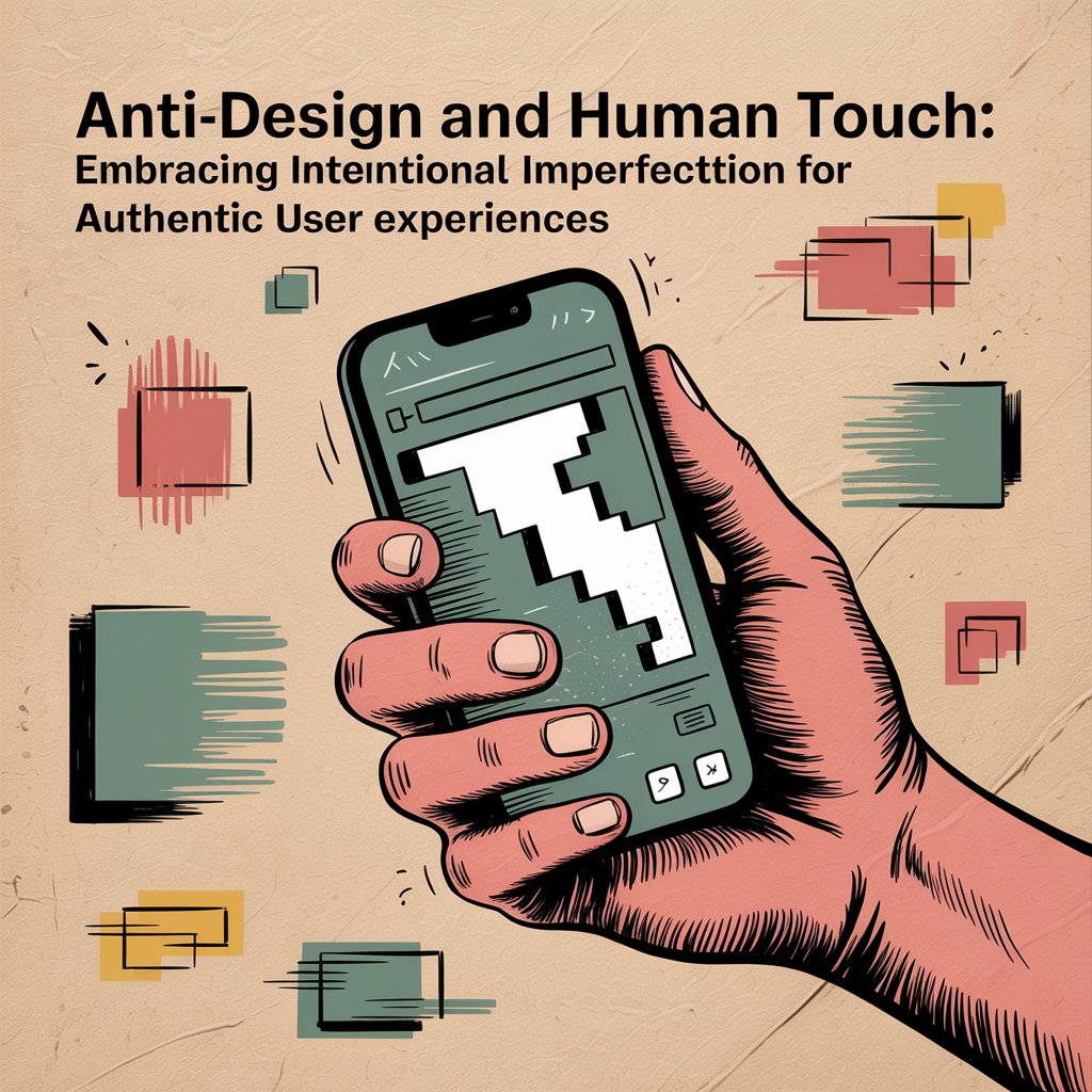
Anti-design represents a conscious departure from polished, sterile digital experiences toward something more organic and relatable. Unlike traditional design principles that prioritize symmetry and perfection, this approach celebrates controlled chaos, hand-drawn elements, and intentional “mistakes” that make interfaces feel refreshingly human.
This movement isn’t about poor craftsmanship—it’s strategic authenticity. Brands like Mailchimp, Spotify, and indie startups have successfully implemented these principles to stand out in oversaturated markets while building stronger emotional connections with their audiences.
The Psychology Behind Imperfect Design
Research in cognitive psychology reveals that humans are naturally drawn to slight imperfections because they signal authenticity. The “pratfall effect” demonstrates how minor flaws can actually increase likability and trust. When applied to digital design, these principles create interfaces that feel approachable rather than intimidating.
Human-centered design principles support this approach by prioritizing user emotions and psychological comfort over aesthetic perfection. Users often find overly polished interfaces cold and corporate, while thoughtfully imperfect designs communicate personality and relatability.
Key Elements of Anti-Design Implementation
Asymmetrical Layouts
Breaking free from rigid grid systems allows content to breathe naturally. Offset elements, varied spacing, and organic arrangements guide users through content in unexpected yet intuitive ways.
Hand-Drawn and Sketch-Like Elements
Incorporating hand-lettered fonts, sketched icons, or doodle-style illustrations adds personality while maintaining professionalism. These elements suggest human involvement rather than automated generation.
Intentional Color Clashes
Strategic use of unexpected color combinations can create memorable experiences. The key lies in purposeful discord rather than random chaos—each choice should serve the brand narrative.
Raw Typography Choices
Mixing font weights, sizes, and styles within reason can create dynamic hierarchies that feel more conversational than corporate. This approach works particularly well for creative industries and startups.
Balancing Authenticity with Usability
The biggest challenge in anti-design implementation involves maintaining functionality while embracing imperfection. Successful projects follow these guidelines:
Preserve Core Navigation: While aesthetic elements can be unconventional, primary user pathways must remain clear and accessible. Users should never struggle to complete essential tasks.
Test Extensively: What feels authentic to designers might confuse users. Regular usability testing ensures that creative choices enhance rather than hinder user experience.
Consider Your Audience: B2B software companies might need subtler applications than creative agencies or lifestyle brands. Understanding your users’ expectations helps determine appropriate levels of unconventionality.
Real-World Success Stories
Several notable brands have leveraged anti-design principles effectively:
Oatly uses crude illustrations and handwritten-style text to communicate their authentic, anti-establishment brand values while maintaining excellent user experience across digital touchpoints.
Ben & Jerry’s combines playful asymmetry with bold colors and quirky typography that perfectly matches their socially conscious, fun-loving brand personality.
Spotify Wrapped campaigns embrace controlled chaos through dynamic, imperfect layouts that feel personal and shareable, generating massive user engagement annually.
Implementation Strategy for Businesses
Start Small
Begin with minor elements like custom illustrations or slightly offset layouts before implementing major asymmetrical changes. This approach allows teams to gauge user response while building internal confidence.
Define Your Authentic Voice
Anti-design works best when it genuinely reflects brand personality. Companies should identify what makes them unique before translating those qualities into visual design choices.
Maintain Professional Standards
Intentional imperfection requires more skill than traditional perfection. Hire experienced designers who understand how to make strategic “mistakes” that enhance rather than detract from user experience.
As artificial intelligence increasingly handles routine design tasks, human creativity becomes more valuable than ever. Anti-design principles position brands to stand out in an
AI-dominated landscape by emphasizing the irreplaceable value of human insight and creativity.
The trend toward authenticity reflects broader cultural shifts away from corporate polish toward genuine connection. Users increasingly seek brands that feel real, relatable, and unafraid to show personality.
Conclusion
Anti-design web design and human-centered design principles work together to create digital experiences that prioritize authentic connection over aesthetic perfection. By thoughtfully embracing imperfection, businesses can build stronger relationships with users while differentiating themselves in competitive markets.
Success requires balancing creative risk-taking with solid usability foundations. When implemented skillfully, anti-design transforms websites from mere functional tools into memorable, emotionally resonant experiences that users genuinely enjoy engaging with.
The future belongs to brands brave enough to show their human side in an increasingly automated world. Anti-design provides the framework for creating those meaningful, imperfect connections that drive long-term user loyalty and business success.

 +91 6282249224


