
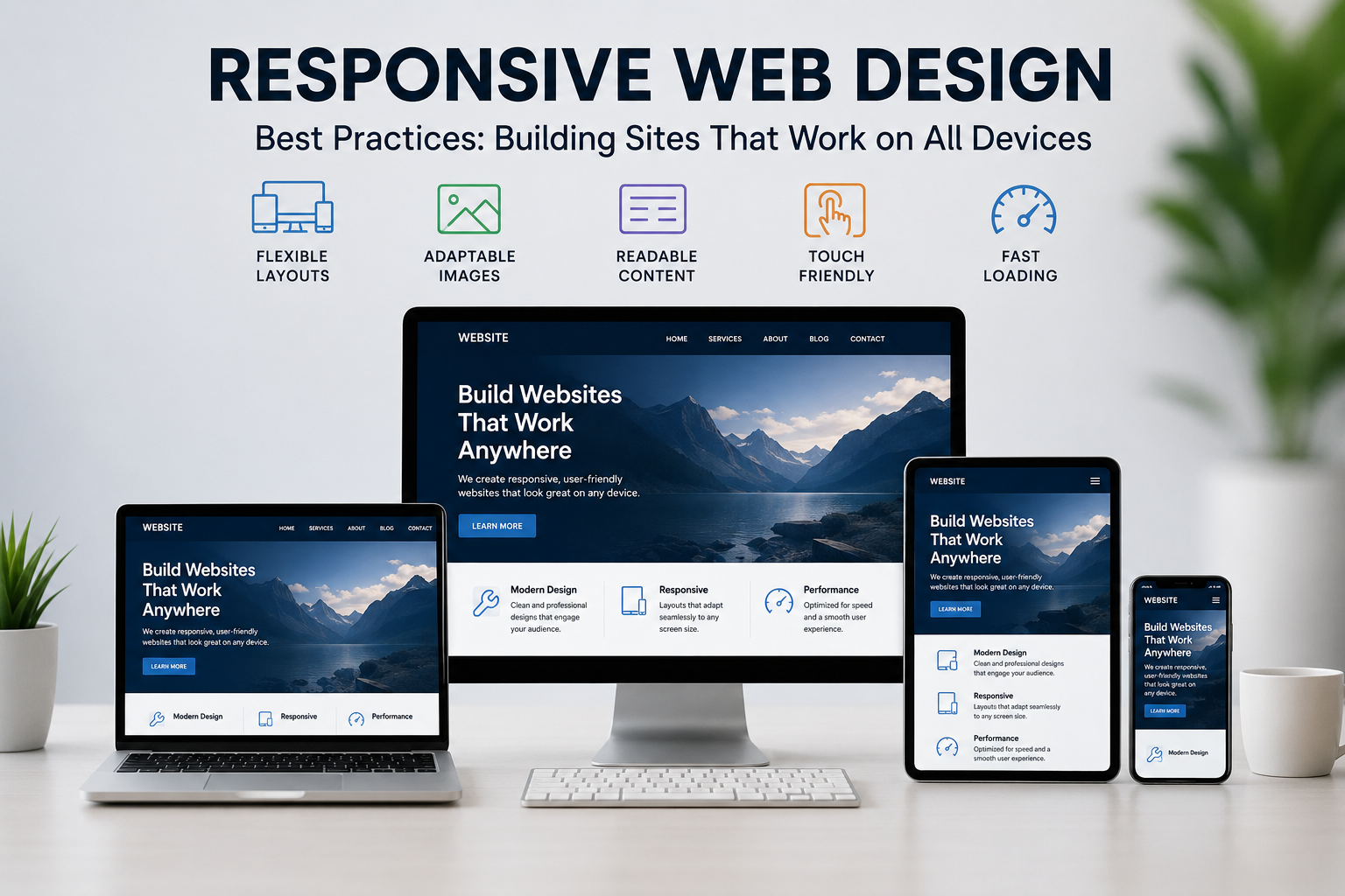
Imagine a potential customer opens your website on their phone, and the layout breaks — text overlaps, buttons are unclickable, and images spill off the screen. They leave in seconds. This happens to thousands of businesses every day because their site wasn’t built with responsive web design in mind.
With mobile devices driving over half of global web traffic, having a website that adapts smoothly across smartphones, tablets, and desktops isn’t optional anymore — it’s the baseline expectation. Whether you’re a startup, an e-commerce brand, or a freelancer building your first portfolio, understanding these best practices is essential to staying competitive online.
In this guide, we’ll walk through what this design approach really means, the core techniques behind it, and how to implement it correctly so your site performs beautifully on every device. If you’re in Kochi, Kerala, and want expert help, Teknoppy’s web design team builds fully adaptive, SEO-ready websites for local and global businesses alike.
Responsive web design is an approach to building websites so they automatically adjust their layout, images, and content based on the screen size and device being used. Instead of creating separate versions of a site for mobile and desktop, a single site reshapes itself fluidly.
This is different from adaptive design, which uses fixed layouts for specific screen sizes. This modern approach, by contrast, uses flexible grid layouts, scalable images, and CSS media queries to create one seamless experience across all devices.
Search engines, especially Google, prioritize mobile-friendly website design in their ranking algorithms through mobile-first indexing. This means Google evaluates your site’s mobile version first when determining search rankings — regardless of how good your desktop layout looks.
Beyond SEO, here’s why cross-device website compatibility directly affects your bottom line:
Businesses that neglect this often end up needing a full overhaul later — a scenario we’ve covered in detail in our post on why your business needs a website redesign.
Rather than designing for desktop and shrinking it down, start with the smallest screen first and progressively enhance the layout for larger devices. This mobile-first web design method forces you to prioritize essential content and functionality, resulting in cleaner, faster-loading pages.
A flexible grid layout uses relative units like percentages instead of fixed pixels, allowing page elements to resize proportionally. This ensures your columns, images, and text blocks rearrange naturally instead of breaking.
CSS media queries are the backbone of responsive website development. They let you apply different styling rules based on screen width, orientation, or resolution. Common breakpoints include smartphone widths around 320 to 480 pixels, tablet widths around 481 to 768 pixels, and desktop widths of 769 pixels and above. Well-planned breakpoints prevent awkward layout shifts between device sizes.
Large, unoptimized images are one of the biggest culprits behind slow-loading sites. Use modern image formats, implement lazy loading, and serve appropriately sized images so devices only download what they need.
Responsive UI design goes beyond layout — it’s about touch-friendly buttons, readable font sizes without zooming, adequate spacing between clickable elements, and navigation menus that collapse cleanly into mobile-friendly formats like hamburger menus.
Browser dev tools are useful, but nothing replaces testing on actual smartphones, tablets, and varying browsers. Small rendering inconsistencies often only appear on real hardware.
Website optimization for mobile devices includes minimizing requests, enabling browser caching, compressing files, and using a Content Delivery Network. Page speed directly affects both user experience and search rankings, especially on mobile networks.
Even experienced developers make these common responsive web design mistakes:
Avoiding these pitfalls is central to good adaptive web design, and it’s one of the most common issues our team finds when auditing client websites during SEO strategy sessions.
Building a flexible, cross-device site from scratch is easier with the right tools. Frameworks such as Bootstrap and Tailwind CSS come with pre-built grid systems and breakpoint utilities, saving development time. Design tools like Figma and Adobe XD allow designers to preview layouts across multiple screen sizes before a single line of code is written. For WordPress users, page builders like Elementor offer built-in device preview modes, making it simple to fine-tune spacing, font sizes, and image scaling for mobile visitors.
Choosing the right combination of design and development tools depends on your project scope, budget, and technical team, but the underlying goal remains the same: a consistent, usable experience regardless of screen size.
For e-commerce businesses, a mobile-optimized site directly impacts sales. Product pages, checkout flows, and payment gateways must function flawlessly across devices, since a large share of online shopping now happens on mobile.
For service-based businesses and startups, responsive website development builds credibility and ensures visitors can easily contact you, book appointments, or explore your offerings — no matter what device brought them to your site. Pairing a solid technical foundation with strong on-page content, like what’s covered on our content writing services page, further strengthens both usability and SEO performance.
Ready to put these responsive web design principles into practice? Here’s a simple roadmap to follow.
If this feels overwhelming, partnering with an experienced digital marketing and web design agency can save significant time while ensuring the technical execution is right the first time.
Responsive web design is no longer a nice-to-have — it’s the foundation of a functional, discoverable, and profitable website. From flexible grid layouts to mobile-first principles, every technique discussed here contributes to a site that performs well for users and search engines alike.
For businesses in Kochi and across Kerala specifically, having a site that performs well on mobile is even more important given the region’s rapidly growing smartphone-first user base. Local customers searching for services on the go expect fast, easy-to-navigate pages, and a well-optimized site can be the deciding factor between a visitor becoming a customer or bouncing to a competitor.
If you’re ready to build or upgrade to a fully adaptive website, explore Teknoppy’s homepage to see how our Kochi-based team combines design, development, and SEO expertise — or visit our blog for more web design insights.
https://teknoppy.com/contact-us/
📞 +91 6282249224
📍 Door No. 49/1253 A, Second Floor, Kaithakal Building, Kaithakal Lane, Near Thykoodam Metro Station, Vyttila P.O., Kochi, Kerala 682019

Communicate with our experts to bring out better solutions to your problem.
 +91 6282249224
This will close in 0 seconds


