A responsive web design guide has become essential reading for anyone building modern websites, as users now access the internet through an overwhelming variety of devices—from smartphones and tablets to desktop monitors and even smart TVs. The days of designing solely for desktop screens vanished years ago, yet many businesses still struggle to create seamless experiences across all platforms. Whether you’re a business owner evaluating responsive design Kochi agencies or a developer seeking to master contemporary techniques, understanding responsive design principles determines whether your website delights users or drives them toward competitors with better mobile experiences.
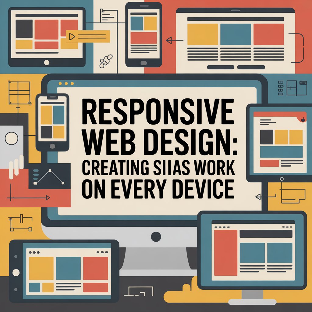
Responsive web design represents an approach where websites automatically adapt their layout, images, and functionality to match the screen size and capabilities of the device being used. Rather than creating separate mobile and desktop versions—an outdated practice that doubles development effort and maintenance costs—responsive design employs flexible grids, fluid images, and CSS media queries responsive techniques to create a single codebase that serves all devices effectively.
The concept emerged in 2010 when designer Ethan Marcotte coined the term, but its importance has only intensified as mobile internet usage surpassed desktop traffic globally. Google’s mobile-first indexing policy, implemented fully by 2021, means search engines now primarily evaluate your site’s mobile version when determining rankings. Sites lacking proper responsive implementation face significant SEO penalties, making this responsive web design guide critical for online visibility.
Mobile responsive design techniques have evolved considerably since responsive design’s inception. Early implementations simply stacked desktop elements vertically for mobile screens—functional but inelegant. Modern approaches consider mobile users’ unique needs, behaviors, and contexts from the ground up, creating experiences optimized for touch interaction, thumb-friendly navigation zones, and reduced data consumption that benefits users on cellular connections.
The mobile-first responsive design methodology flips traditional design processes, starting with mobile layouts before progressively enhancing for larger screens. This approach forces designers to prioritize essential content and functionality, eliminating clutter that desktop designs often accumulate.
Beginning with mobile constraints encourages clarity. Limited screen real estate demands careful content hierarchy decisions, ensuring users see critical information immediately without scrolling through bloated headers or excessive navigation menus. This disciplined approach typically produces cleaner desktop experiences too, as the core content structure remains focused and user-centric.
Progressive enhancement follows mobile-first design naturally. Once mobile layouts work perfectly, designers add features for tablet and desktop users—larger images, multi-column layouts, hover effects, and expanded navigation options that make sense on bigger screens with mouse or trackpad input. This contrasts with graceful degradation, where desktop sites are stripped down for mobile, often resulting in awkward compromises and broken functionality.
Responsive design Kochi agencies increasingly adopt mobile-first workflows, recognizing that Kerala’s internet users predominantly browse via smartphones. Local businesses serving regional audiences particularly benefit from mobile-optimized experiences that load quickly even on modest cellular connections prevalent outside major cities.
CSS media queries responsive techniques form the technical backbone enabling responsive layouts. Media queries allow developers to apply different CSS rules based on device characteristics like screen width, height, orientation, and resolution.
Basic media query syntax follows this pattern:
/* Mobile styles (default) */
.container {
  width: 100%;
  padding: 15px;
}

/* Tablet styles */
@media (min-width: 768px) {
  .container {
    width: 750px;
    margin: 0 auto;
  }
}

/* Desktop styles */
@media (min-width: 1024px) {
  .container {
    width: 970px;
  }
}
Common breakpoints typically target phones (up to 767px), tablets (768px-1023px), and desktops (1024px and above), though modern best practice suggests letting content determine breakpoints rather than device categories. If your navigation breaks at 890px, add a breakpoint there regardless of whether it matches standard device sizes.
Advanced mobile responsive design techniques employ multiple media query features beyond width. The orientation property detects landscape versus portrait mode, useful for optimizing layouts when users rotate tablets or phones. The resolution query helps serve high-quality images to Retina displays without wasting bandwidth on standard screens.
Container queries, a newer addition to CSS, allow components to respond to their parent container’s size rather than the viewport. This enables truly modular component design where elements adapt regardless of page context—revolutionary for component-based frameworks like React or Vue.
Rigid pixel-based layouts shatter responsive design immediately. Modern responsive sites employ flexible grids using percentages, viewport units, or CSS Grid and Flexbox for layouts that scale proportionally across screen sizes.
CSS Grid excels at creating complex two-dimensional layouts with minimal code. Define grid templates that rearrange automatically based on available space:
.grid-container {
  display: grid;
  grid-template-columns: repeat(auto-fit, minmax(300px, 1fr));
  gap: 20px;
}
This creates a responsive grid where items automatically wrap to new rows when screen width can’t accommodate the minimum 300px item width—no media queries required.
Flexbox handles one-dimensional layouts beautifully, perfect for navigation menus, card layouts, or any components that should distribute evenly across available space. Combined with media queries, Flexbox enables sophisticated responsive behaviors with surprisingly little code.
Viewport units (vw, vh) size elements relative to browser window dimensions. While powerful, use viewport units carefully as they can create accessibility issues when users zoom page content.
Images pose unique responsive challenges. Serving desktop-sized images to mobile users wastes bandwidth and slows page loads unnecessarily, while serving mobile-optimized images to desktop users creates pixelated, unprofessional appearances.
The srcset attribute solves this by letting browsers choose appropriate image sizes:
<img
  srcset="small.jpg 480w, medium.jpg 768w, large.jpg 1200w"
  sizes="(max-width: 768px) 100vw, 768px"
  src="medium.jpg"
  alt="Responsive image example"
>
Modern image formats like WebP and AVIF provide superior compression, reducing file sizes by 30-50% compared to JPEG without quality loss. Implement progressive JPEGs that display low-resolution previews while full images load, improving perceived performance.
Lazy loading delays image loading until users scroll near them, dramatically improving initial page load times. Native browser lazy loading via loading="lazy" attributes requires no JavaScript, making it the simplest implementation.
Video embeds from YouTube or Vimeo automatically resize with CSS, but hosting your own videos demands responsive techniques like aspect ratio containers that maintain proportions across devices.
Mobile users navigate via touch, demanding interface adjustments beyond simple layout changes. Touch targets should measure at least 44×44 pixels (Apple’s guideline) or 48×48 pixels (Google’s recommendation) to accommodate average finger sizes and prevent misclicks.
Space interactive elements adequately—cramped buttons lead to frustrated users tapping wrong items repeatedly. Navigation menus particularly benefit from generous spacing, transforming desktop’s compact layouts into thumb-friendly zones on mobile.
Hover effects don’t translate to touch devices, so implement alternatives. Dropdown menus triggered by hover should use click/tap on mobile. Consider showing “tooltips” via tap-and-hold gestures rather than hover.
Gesture support enriches mobile experiences. Implement swipe navigation for image galleries, pull-to-refresh for dynamic content, and pinch-to-zoom where appropriate (though avoid disabling browser zoom, which creates accessibility barriers).
Responsive design shouldn’t compromise performance. Mobile users often browse on cellular connections, making speed critical for usability and SEO.
Minimize HTTP requests by combining CSS files, using CSS sprites for icons, and implementing SVG graphics that scale infinitely without quality loss or file size penalties.
Critical CSS techniques inline styles needed for above-the-fold content, deferring remaining CSS to prevent render-blocking. This ensures users see page content immediately while additional styles load in background.
JavaScript impacts mobile performance significantly. Audit your scripts, removing unnecessary libraries and deferring non-critical JavaScript. Tools like Lighthouse identify optimization opportunities specific to mobile performance.
Browser DevTools provide responsive testing modes that simulate various devices, but nothing replaces testing on actual hardware. Borrow phones and tablets from friends, visit device labs, or use cloud-based testing services like BrowserStack.
Test across browsers—Chrome, Safari, Firefox, and Edge all handle responsive design slightly differently. Don’t forget older browser versions still used in some markets.
Performance testing should occur on real mobile networks, not just WiFi. Throttle your connection to 3G speeds using DevTools to experience what users on slower networks encounter.
This responsive web design guide provides the foundation for creating websites that deliver excellent experiences across all devices. From mobile-first responsive design principles to CSS media queries responsive implementation and mobile responsive design techniques, each element contributes to sites that adapt gracefully whether viewed on the latest smartphone or a legacy desktop browser. As device diversity continues expanding, responsive design evolves from optional enhancement to absolute necessity. Whether working with responsive design Kochi agencies or building in-house, prioritizing responsive principles ensures your website remains accessible, performant, and competitive in an increasingly mobile-first world.

Communicate with our experts to bring out better solutions to your problem.
 +91 6282249224
This will close in 0 seconds


